The poetic of printing
I have talked in previous blog posts about my reignited love of poetry. Beyond simply obsessing over the work of my favourite authors, this renewed interest has taken me on a journey to understand their work more deeply, reading book after book (over 20 and counting!) of poetic analysis. One thing that still strikes and amazes me in these readings is how no detail is left to chance in a (good) poem. Great poets use a variety of tools in their works, from linguistics (semantics, syntax, phonetics..), to rhetorics (metaphors and other figure of speech etc..) or prosody (meter, rhyme, caesuras, enjambments, …), as well as building on a frame of intertextual (or hypotextual) references so that a poem becomes a rich structure which can be read at different levels.. Often these various levels will work together to reinforce each other ( for example when the meter of the poem mirrors the content), sometimes they can add to it, or even deliberately undermines it (for example in the cases of parodies). But nothing is ever accidental, and the muse has little to do with it…
This is something that I have been trying to take into my own creative practice. Thankfully, this has not meant that I have restarted writing poetry- some things are best left behind! But I am trying to make more conscious decisions over not just the content of my work, but the form as well. I am trying to approach pieces not simply by thinking about what I want to convey with them, through composition and colour choices for example, but also by trying to use the tools of screen-printing more effectively based on the meaning/ intention of the piece.
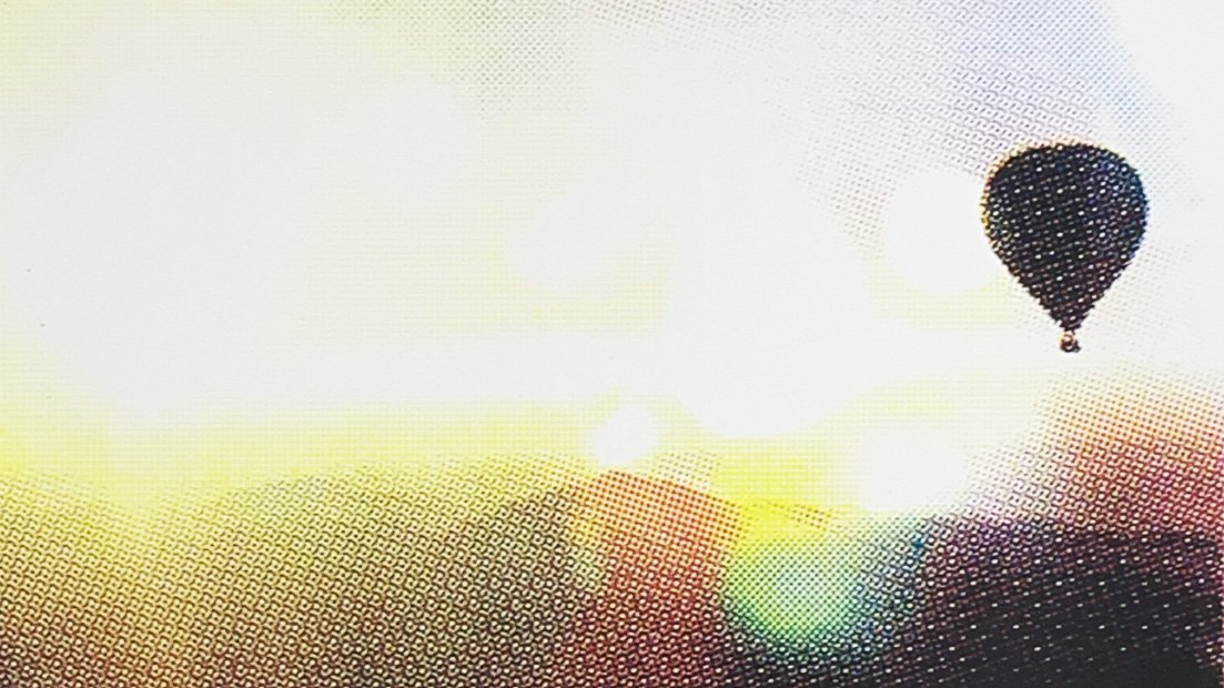
Looking more closely as my most recent works (and the ones I am currently working on), the intention of the piece is to focus on how light works in a landscape, how it can almost obliterate the image, or at the very least transform it. I have accentuated this aspect in some pieces in the past by adding light effects or artefacts, or changing the lighting to accentuate certain colour schemes- this is something I have done for a while.
In recent works though , I then chose to use CMYK to create these prints, to go further in this research: This is not simply a technical exercise, to create colour schemes in different ways but a way to further explore the impact of light and its relation to colour. I am deliberately keeping the halftone patterns visible (whereas more often than not, CMYK halftones are very small so as to be barely perceptible to the naked eye) so that the image further decomposes into colours, as if the light is being diffracted through a prism, thus reinforcing the impact it has on the landscape it depicts and illuminates.
Of course this is only one tool, used to create one specific type of effect and it will not work for all my prints. I will need to work out how to use other tools to reinforce or undermine different intentions in future works , and this feels quite daunting. But at this stage of the exploration process, it feels like this approach as given me a deeper sense of control over what I am doing. I still love happy accidents, and they remain something I welcome in my print making practice, but this ongoing reflection should lead to using the printmaking tools at my disposal more deliberately in future works, and that can only be a good thing.